Uber Hides Its Surge Pricing Alert
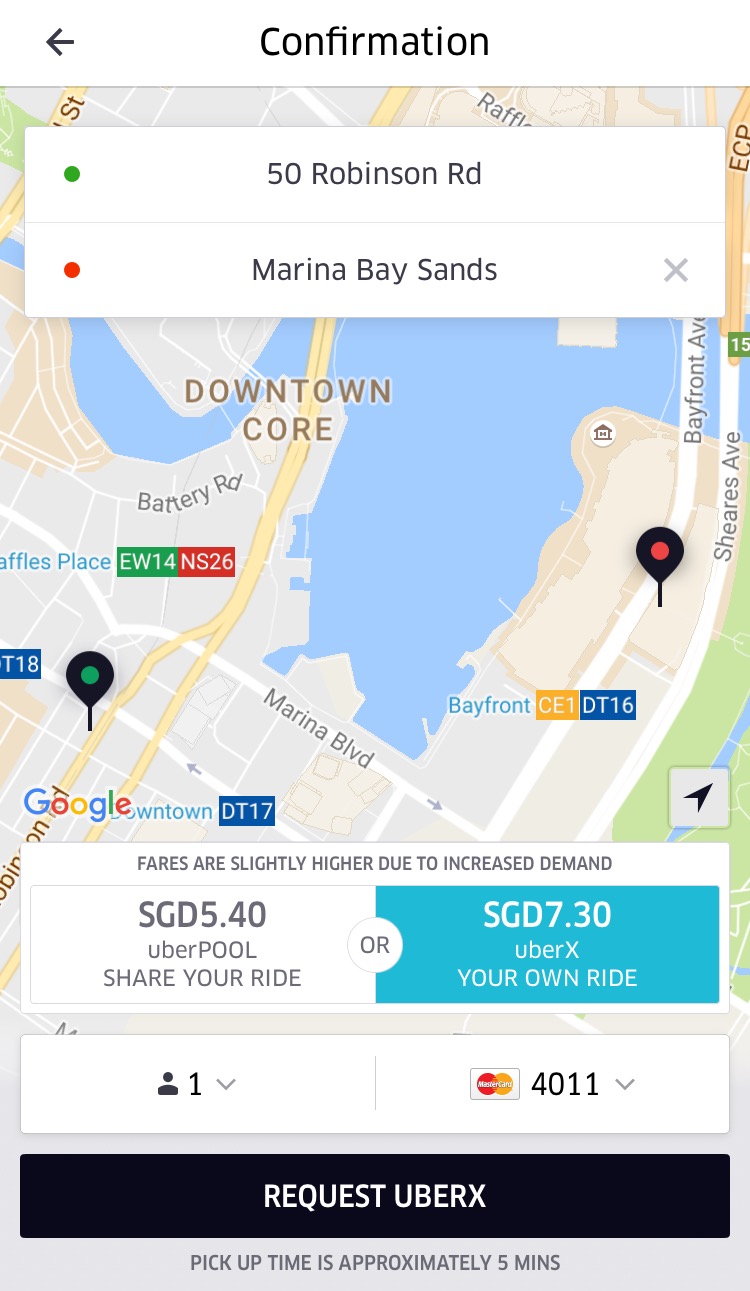
Some of the more sharp-eyed readers amongst you may have noticed a slight but subtle difference while hailing rides from Uber recently. I am of course talking about the changes in the Surge Pricing Alert. For Uber X customers, easily the most numerous of all types, the Surge Pricing page no longer appears before searching for a ride. Instead, we are left with a thin tab above the fares stating “fares are slightly higher due to increased demand”. According to Uber, this change was done to make the app less complicated.

The more low key alert may mean that customers who are in a hurry or drunk from a night out drinking with friends are less likely to notice the surge. However, the more serious matter may be that the multiplier of the surge is no longer shown. From personal experience, the multiplier has allowed me to assess my options. I was able to take a rate of 10%-20%. Anything above that and I would see if GrabCar could offer me something more attractive. If not, I would hail a metered taxi and pray to the traffic Gods. The lost of the multiplier also means that it is harder to gauge the standard price one would pay, particularly if one is unfamiliar with the route.
Does this change truly make the app less complicated like Uber claims or is it a clever ploy by Uber to target the unsuspecting consumer? Share your thoughts in the comments section below.


